For our latest Inside Brands session, in partnership with Monotype, we looked at the new visual identity and name for parcels brand Evri and the impact it has had on the work of its in-house studio.
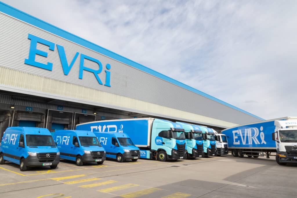
In March this year, parcels delivery firm Hermes changed its name to Evri. The name change was accompanied by a radical new visual identity which makes use of a variable type system capable of producing over 194,000 different versions of its logo, the idea being to create an identity system with ‘A living logo for every parcel, person, and place’. The new identity was created by the combined efforts of a team from Evri, brand consultancy Superunion and type designers Monotype, working over 15 months from start to public launch.
For our IHALC Inside Brands session on October 19, we brought together four key members of the team to discuss the project: Evri Senior Brand Manager Caroline Watson and Senior Graphic Designer Clive Holloway; Superunion Senior Creative Director Mark Wood and Monotype Senior Creative Type Director Phil Garnham.
If you’d like to watch a recording of the session, please find it here.
I’ve pulled together a few key insights:
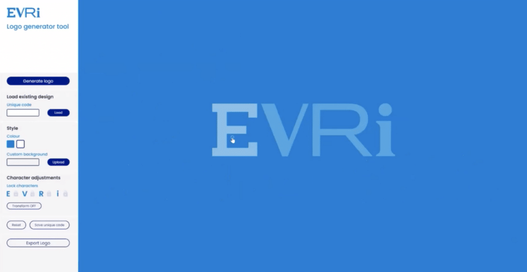
The identity reflects shifts in thinking about how brands need to behave in order to be relevant today: that brands want to be able to move quicker, to talk to customers in a way that feels personal and immediate, with high volumes of messages. The old principles of repetition, recognition and consistency, while not abandoned entirely, have been reframed for a world in which everything is mutable. The power to create assets has been transferred into the hands of everyday users, such as an in-house studio, equipped with digital tools. For Evri, Superunion’s tech team built a logo generator (shown below) that allows users freedom to create on-brand assets but within a framework that ensures some degree of control.
This approach addresses a common practical challenge for ‘always on’ brands – the need to be able to create huge volumes of distinctive assets at great speed without incurring unsustainable costs. The previous Hermes identity was illustration-based, meaning that creating new assets often meant creating new artwork. The studio found it cumbersome and that it took up too much of senior creatives’ time. On a cost-per-asset basis, a variable type system could work out much cheaper – and more controllable from a cost point of view – than, say, a photographic solution.
The Evri identity is the product of a collaborative way of working between marketers, in-house studios and external agencies that is increasingly common, encouraging genuine partnership. Once it was agreed to go down the variable type route, a project team from Evri, Superunion and Monotype was set up which met twice-weekly. Design decisions were taken jointly as a group.
The visual solution was derived from an agreed strategy for the business and brand. Superunion’s strategy team ran a series of workshops with the Evri senior leadership team to get to the essence of the Evri brand. This strategy was agreed by the SLT. Once design work began, and stakeholders were asked for approval on specifics, having this strategy in place enabled the design team to be able to push back with stakeholders who gave subjective feedback, using the agreed strategy as a reference point. The question became not ‘do you like it?’ But ‘does it fit with the strategy we agreed?’.
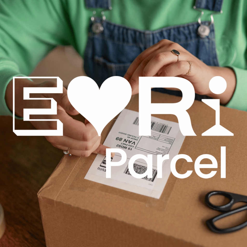
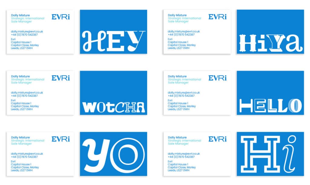
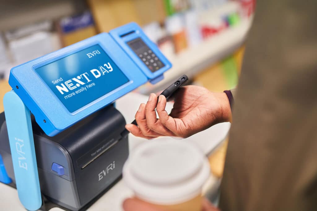
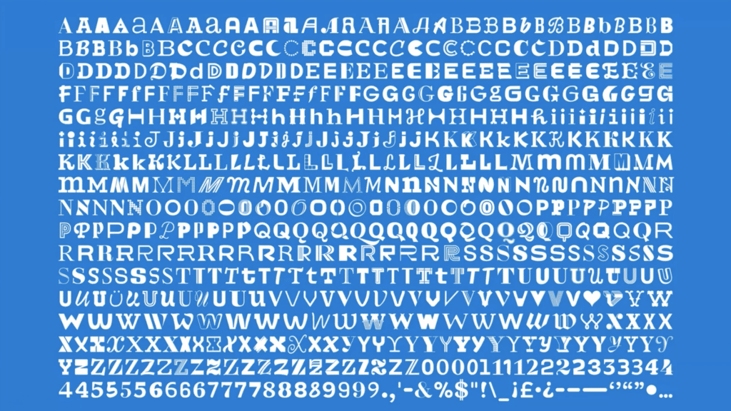
The core typeface includes multiple different styles for each character to express the brand idea of ‘every delivery made for you’. It is programmed in such a way that random characters appear as a headline is typed into it, potentially allowing each asset to be unique. The typeface is full of quirky details such as Qs made from a roll of parcel tape and a speech bubble, a V as a heart, and an X chromosone. Making it pushed the boundaries of variable typeface technology beyond anything that Monotype had previously created for a brand. But its complexity actually makes life easier for the in-house studio as it is now far quicker to make distinctive assets that align with the brand guidelines but are also distinctive and appropriate for each use.
If you’d like to watch a recording of the session, please find it here.